Industry
Creative Arts
What we did
Animation
Brand identity
Brand guidelines
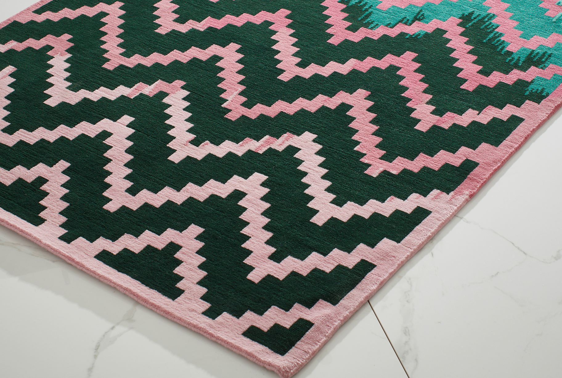
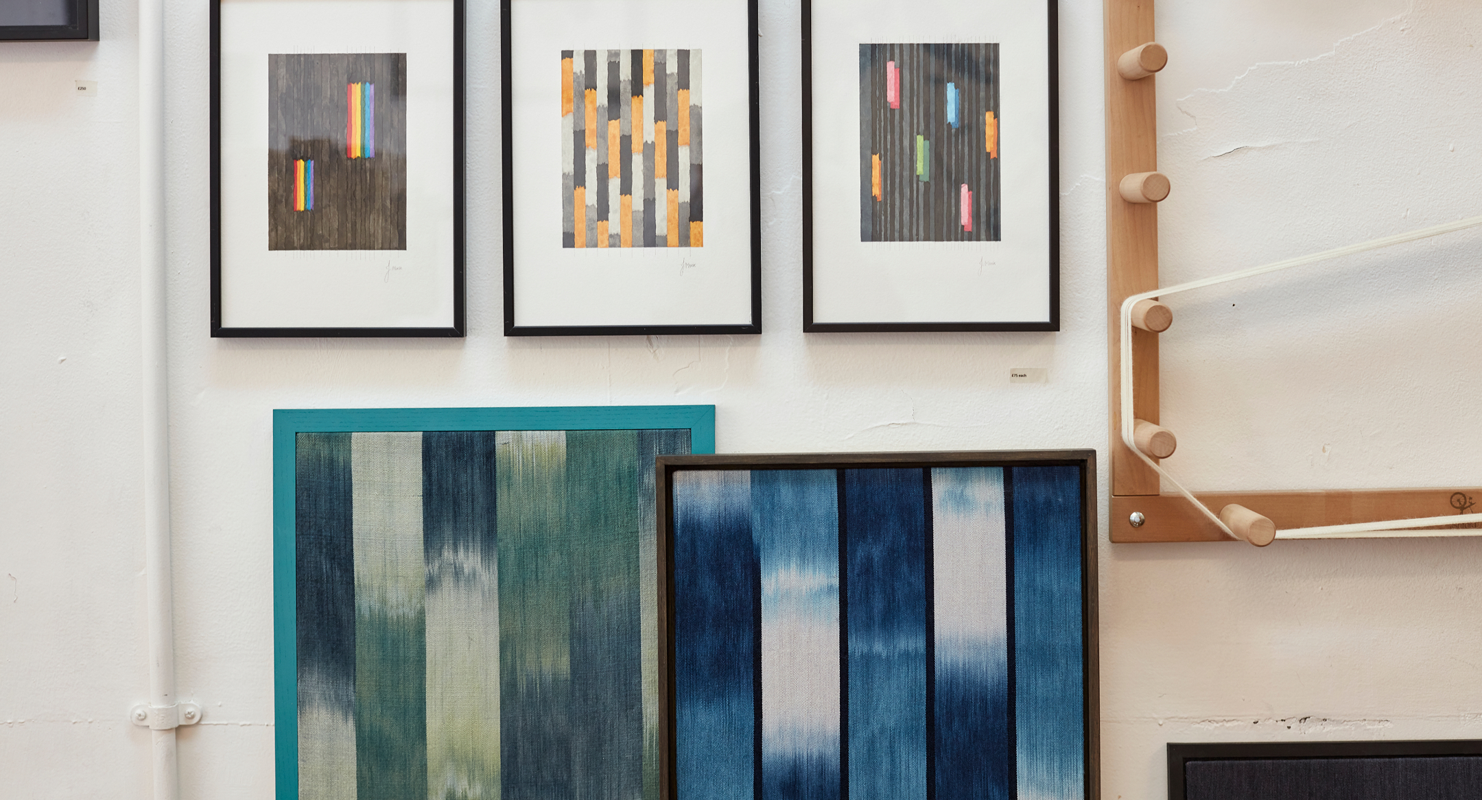
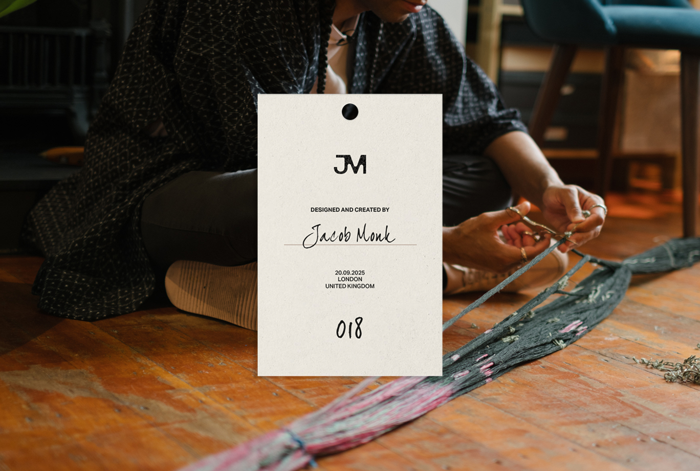
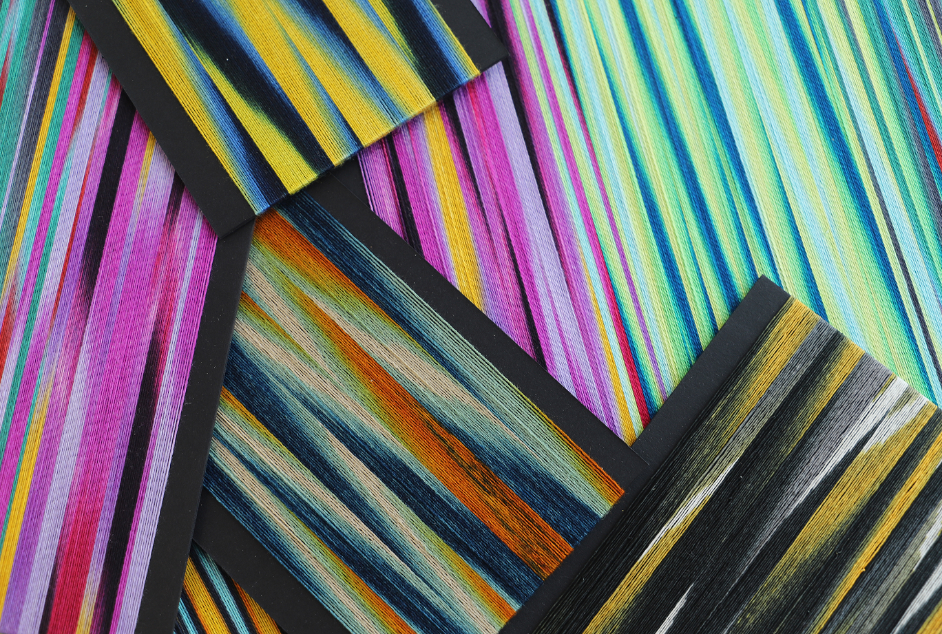
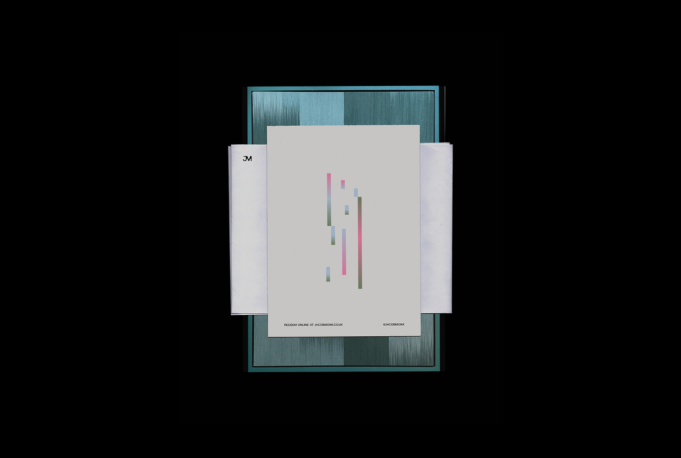
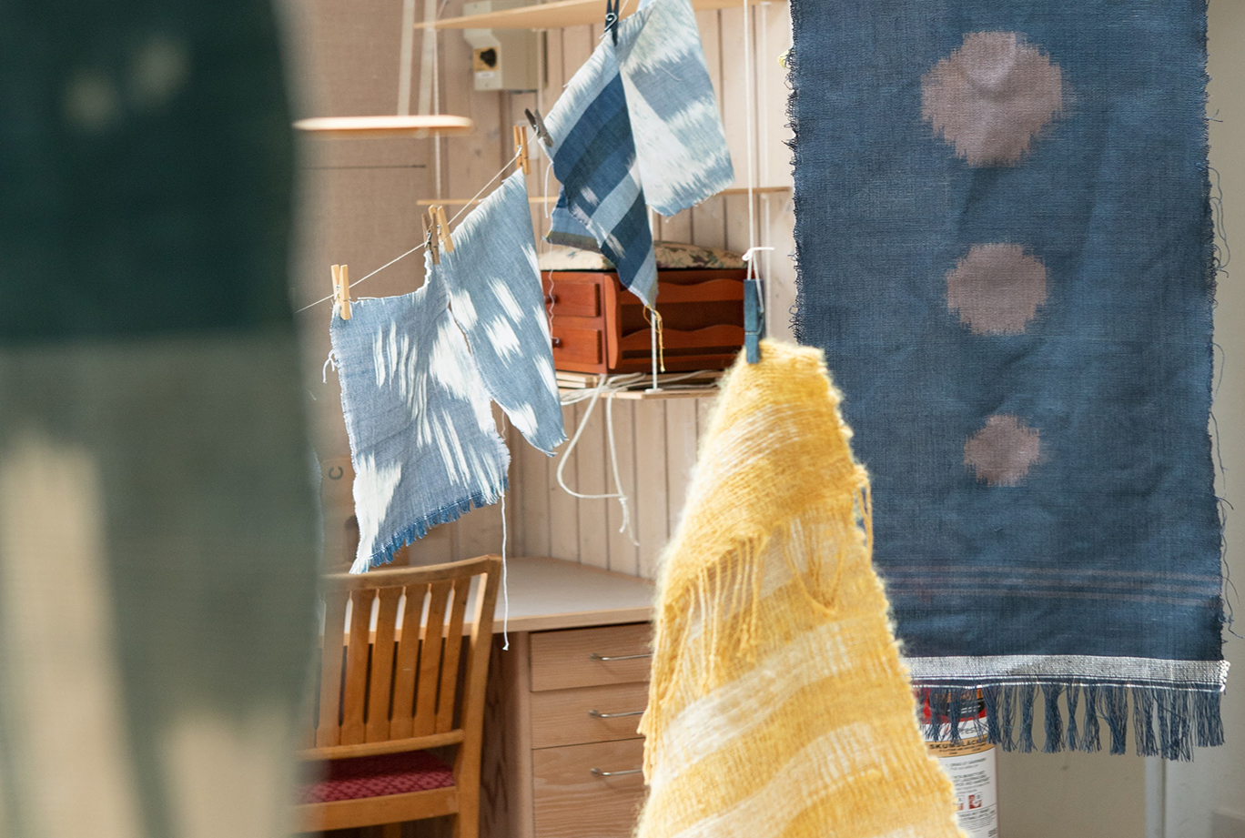
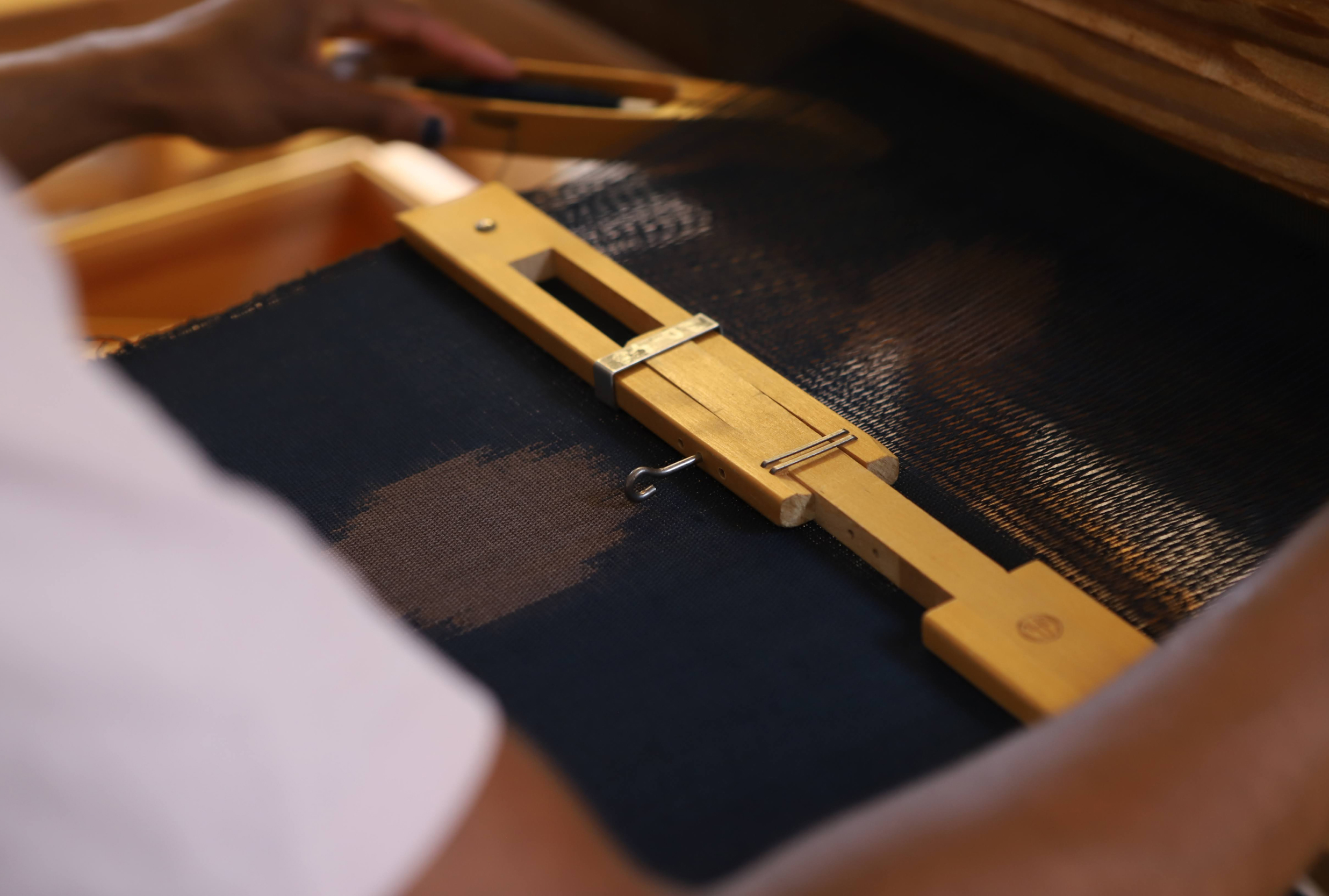
That was our challenge with Jacob Monk, a textile artist known for bold colour, intricate ikat techniques and seriously tactile work. We needed to build an identity that didn’t justshowhis craft but made peoplefeelit, even through a screen.We created a visual system inspired by what makes his work special: the natural dyes, the rhythmic patterns, the imperfect edges that make each piece one-of-a-kind. Nothing overly polished - just honest texture and colour, translated with clarity. The new identity balances Jacob’s personality - his humour, his hands-on spirit, his attention to detail - with contemporary energy. A warm, characterful tone of voice, a palette lifted from the studio table and typography that mirrors the movement of the loom. Together, it gives Jacob a brand that feels tactile, modern and true to the maker behind it, ready to take his work to the next level.